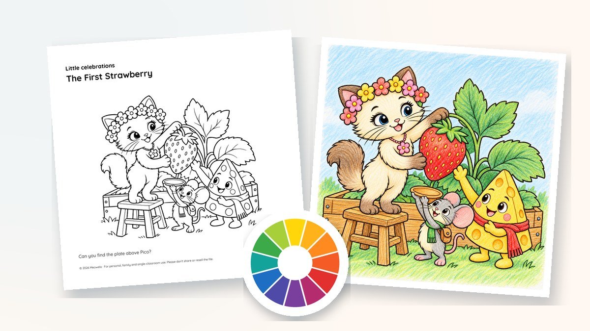

Color theory for kids comes down to four ideas: the color wheel, warm and cool colors, light and dark, and colors that look exciting side by side. Red, yellow and blue are the primary colors; mixing two of them makes orange, green or purple. Reds, oranges and yellows feel warm, while blues, greens and purples feel cool. Pressing lightly or heavily makes any color lighter or darker. And opposite colors on the wheel, like orange and blue, make each other look brighter.
That’s enough color theory to change how a child of 6 to 12 looks at a coloring page. None of it is a rule. It’s a set of tools children can pick up, try and put down again, and they still choose every color. Below you’ll find each idea explained in plain words, what suits each age, six activities to try on a real page, and the supplies that make mixing and shading easier.
Affiliate disclosure. Some links below go to Amazon, and Meowelo may earn a commission if you buy through them, at no extra cost to you. As an Amazon Associate I earn from qualifying purchases. Amazon does not sponsor or endorse Meowelo. We list supplies that suit these books, and say what each one is not good for too. Full disclosure.
What is color theory, in kid-friendly words?
Color theory is simply what artists have noticed about how colors mix and how they look next to each other. For a child, it answers questions they already ask at the table: How do I make green if I don’t have green? Why does this sky look so bright? How do I make the fur look darker underneath?
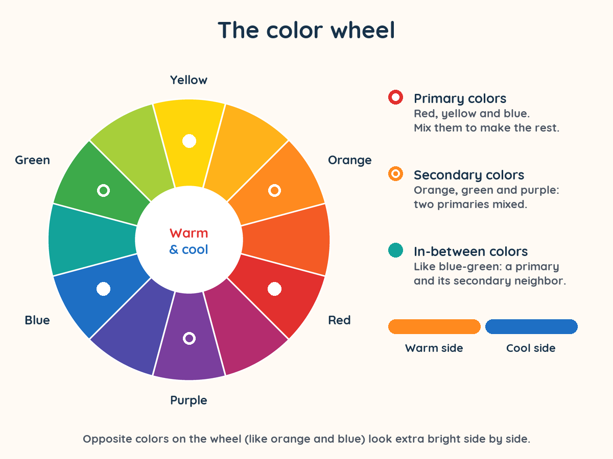
The easiest way to see it all at once is the color wheel: the colors of the rainbow bent into a circle, so every color sits beside its closest relatives.
Primary, secondary and in-between colors
In art class, children learn three primary colors: red, yellow and blue. Mix two primaries and you get a secondary color:
| Mix | You get | Try it on |
|---|---|---|
| Red + yellow | Orange | A sunset, a pumpkin, Riyu’s tabby fur |
| Yellow + blue | Green | Leaves, a meadow, a pond |
| Blue + red | Purple | An evening sky, flowers, a kite |
Between each primary and secondary color sits an in-between color (artists call them tertiary colors), such as blue-green or red-orange. Twelve slices in all, and every one of them can be made from the three primaries.
A good question to expect: “But my printer uses different colors!” It does. Printers mix cyan, magenta and yellow ink, and screens mix red, green and blue light. Red, yellow and blue is the painter’s version, and it’s the one that works best with crayons, pencils and paint.
Warm and cool colors
Fold the color wheel in half and you get two families. Warm colors (reds, oranges, yellows) remind us of sunshine, fire and summer fruit. Cool colors (blues, greens, purples) remind us of water, shade and night skies.
Children can use the two families to set the mood of a scene. A party table in warm colors feels like a sunny afternoon; the same table in cool colors feels like a moonlit evening. Neither is right. They are just two different stories told by the same picture. Painters also notice that warm colors tend to seem closer and cool, paler colors seem farther away, which is why distant hills are often painted a soft blue.
Light and dark: tints, shades and pressure
Every color has a light version and a dark version. Painters add white to make a tint and a darker color to make a shade. With colored pencils and crayons it’s even simpler:
- Press lightly for a soft, pale color, like a morning sky.
- Press harder or add another layer for a deep, rich color.
- Add a darker neighbor from the wheel for shadows: a little blue on the shady side of a green leaf, a little red-brown under an orange tail.
This is where a child’s coloring starts to look three-dimensional, and it’s a lovely next step for children who have mastered filling shapes. Our guide to colored pencils for kids covers which pencils are soft enough to shade without pressing hard.
Colors that pop: opposites and neighbors
Two more ideas from the wheel are worth knowing:
- Opposite colors (complementary colors) sit straight across the wheel from each other: red and green, yellow and purple, blue and orange. Placed side by side, each makes the other look brighter. A small orange kite in a big blue sky is almost impossible to miss.
- Neighbor colors (analogous colors) sit next to each other, like yellow, yellow-orange and orange. They look gentle and connected, which makes them perfect for sunsets, autumn leaves and fur.
You can spot both in the Meowelo friends. Lunai’s royal-blue hoodie and his golden crescent pendant sit almost across the wheel from each other, so the pendant stands out. Cheddo’s golden-yellow cheese and red neckerchief are close neighbors on the warm side, so he looks bright and cheerful all over. Of course, on any coloring page, the friends can be any colors your child likes.
What color theory looks like at each age
Children pick these ideas up at their own pace. Use this as a rough guide, not a syllabus:
| Age | Ideas to play with | An easy way in |
|---|---|---|
| 6–7 | Naming primary and secondary colors; mixing | Mix two paint colors and guess the result before you look |
| 8–9 | Warm and cool; light and dark with pressure | Color one page warm and one page cool, then compare |
| 10–12 | Opposites, neighbors, shading and planning a palette | Choose three neighbor colors and one opposite for a whole page |
6 easy color theory activities to try today
Each activity takes one printed page and a handful of supplies. Do one, keep the page, and try another another day.
- Guess the mix. With paint or by layering pencils, mix two primaries. Guess the color first, then check. Then try mixing a primary with a secondary to find an in-between color.
- Warm twin, cool twin. Print the same page twice. Color one only in warm colors and the other only in cool colors. Put them side by side: which one feels like morning, and which feels like evening? There’s no wrong answer.
- The light-to-dark ladder. Draw five boxes in a row and fill them with one pencil, pressing a little harder each time. Then use the ladder to shade one thing on a page, like a strawberry or a tree trunk.
- The one-opposite pop. Color most of a page in one color family, then choose a single small detail and color it in the opposite color. Watch where your eye goes first.
- Make your own wheel. Draw a circle, divide it into twelve slices and fill it in with your own supplies. A homemade wheel taped beside the coloring spot is more useful than any poster.
- Three-neighbor palette. Pick three colors that sit side by side on the wheel and color a whole page with only those, plus one surprise color if you like.
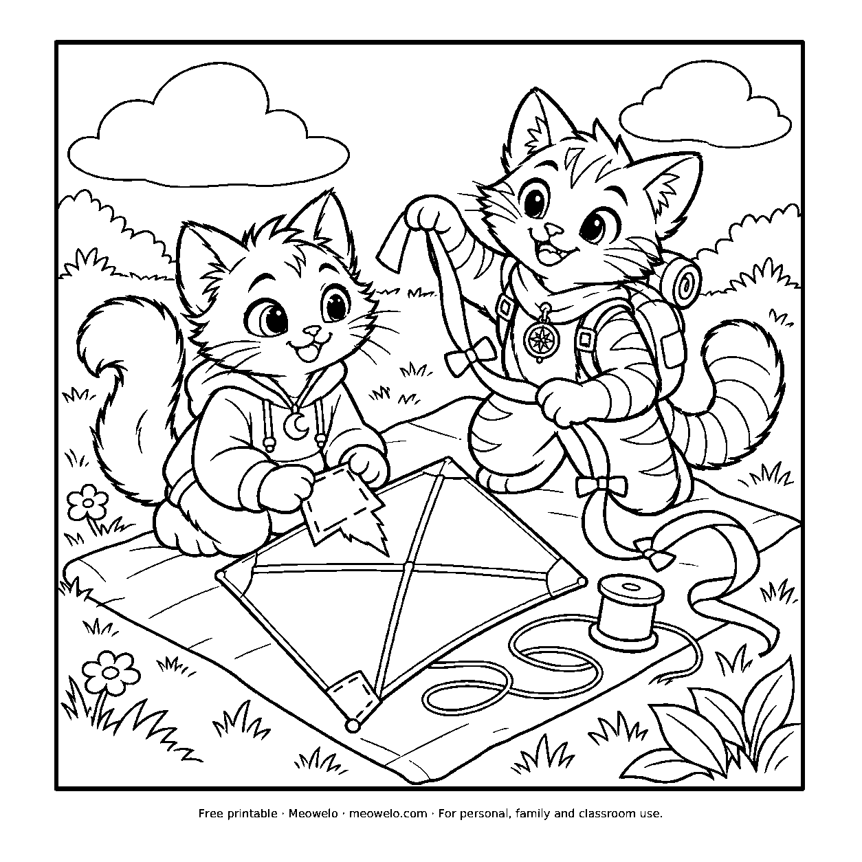
The Rainbow Kite
Lunai and Riyu turn a tangled kite tail into a meadow ribbon dance.
Print it freeThe supplies that make color theory easier
You don’t need anything special to explore color, but a few supplies make mixing and shading more satisfying. These are the ones from our Creative Supplies shelves that suit this kind of play best, each with an honest note on who it suits.
Supplies for mixing, shading and exploring color
| Pick | Best for | Good to know | Buy |
|---|---|---|---|
 Best for real color mixingCrayola Washable Watercolor Paint Set for Kids
|
Washable formula for easier clean-up | Needs thicker paper: too wet for thin book pages | Check price on AmazonView on Amazon Paid link |
 Best for layering and shadingCrayola Colored Pencils, 36 Count
|
36 shades, including useful in-betweens | Needs a sharpener eventually | Check price on AmazonView on Amazon Paid link |
 Best for lots of in-between shadesCrayola Crayons, 64 Count
|
Plenty of in-between shades | Not washable | Check price on AmazonView on Amazon Paid link |
|
Best add-on for skin tones and furCrayola Colors of the World Colored Pencils, 24 Count
|
Real people can look like real people | Not a full palette on its own: no blues or greens | Check price on AmazonView on Amazon Paid link |
Amazon shows the current price and delivery. Tap any name for our full write-up, including what it’s not good for.
Using watercolors? Paint on thicker paper, because thin printer paper wrinkles when it gets wet, and keep a jar of clean water for rinsing so the colors don’t all turn brown.
Are some colors relaxing?
Many people describe soft blues and greens as calm-looking and bright reds and oranges as lively, and those associations are useful for setting the mood of a picture. But colors don’t work like switches. How a color feels depends on the person, the moment and the picture around it, and research on color and mood is far more mixed than many websites suggest. A child who loves a fiery red may find it the most comfortable color in the box.
So we treat warm and cool as a storytelling tool, never as a way to change how a child feels, and we never tell children which colors they should use. If you’re curious about what children’s color choices do and don’t mean, our article on purple grass and black suns goes deeper.
How Meowelo pages are made for color play
Every Meowelo page is printed in black and white, with bold, closed shapes and nothing shaded in gray, so every color decision is left to the child. Each book follows the same rhythm: READ a short story moment, NOTICE the details, COLOR it your way and DISCOVER what happens next. The colored examples we share online are only one idea: something to borrow, copy, change or ignore.
Want a whole pack to experiment on? Meowelo Celebrations: Party & Birthday Coloring Pages has 24 party and birthday scenes and eight card panels, plenty of balloons, cakes and ribbons for warm-and-cool experiments. There’s a free sample page on its page to try first.
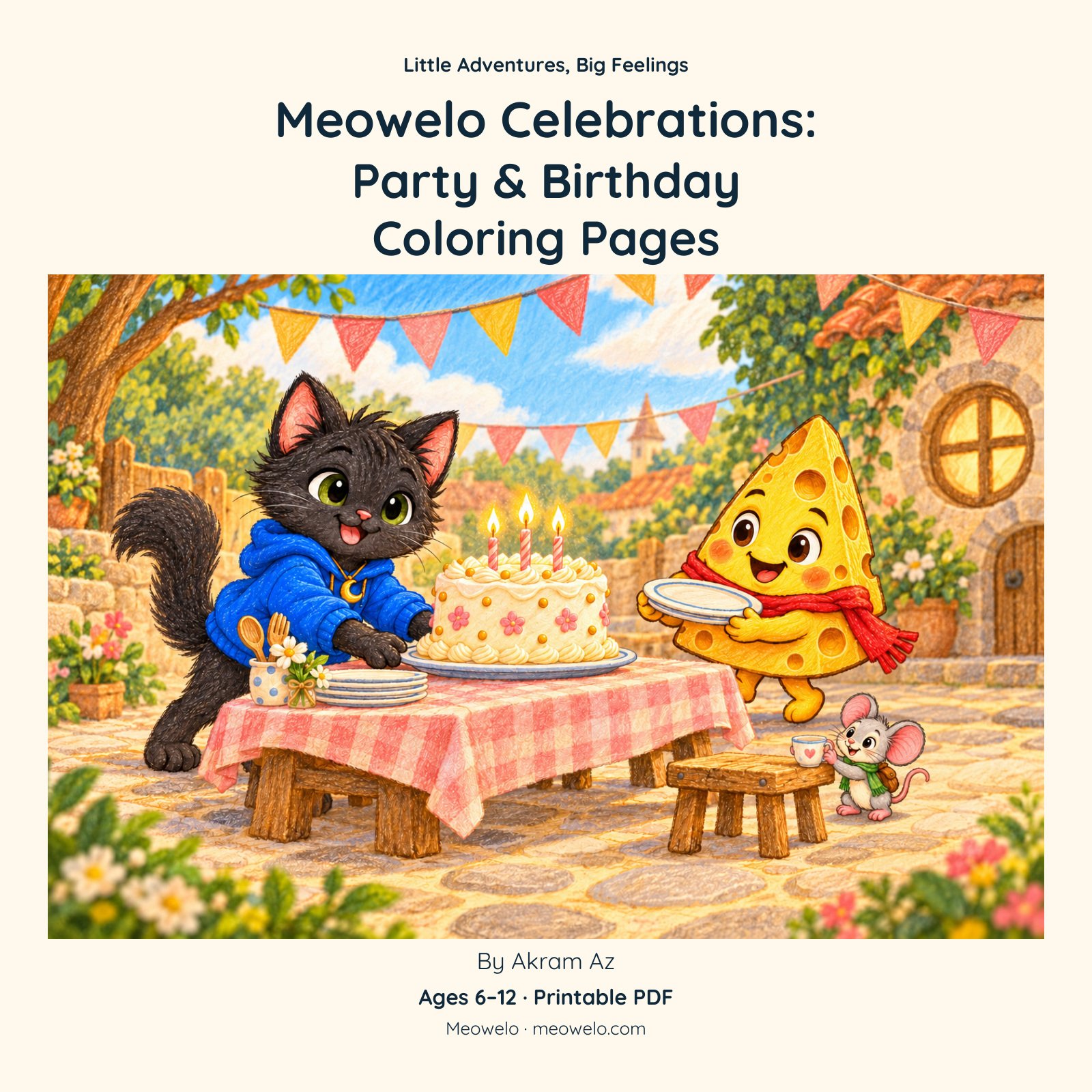
Meowelo Celebrations: Party & Birthday Coloring Pages
Birthday scenes, everyday parties and coloring cards to make and give
Questions parents ask
What is color theory for kids?
What are the primary colors for kids?
What age should kids learn about the color wheel?
How do you mix colors with colored pencils?
What are warm and cool colors?
What are complementary colors?
Are blue and green relaxing colors?
Should I tell my child which colors to use?
The one thing to remember
Color theory gives children new ways to say what they want on the page: warmer or cooler, lighter or deeper, gentle or bold. Teach the wheel, try one activity, and then step back. The best color choice is still the one your child makes.
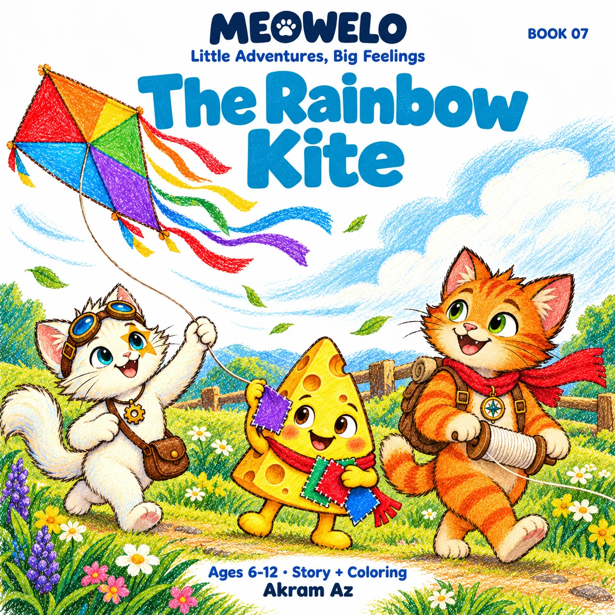
The Rainbow Kite
An old kite, a lot of patches, and one tricky breeze.
With Lunai, Riyu, Myro, Naeli, Rinwa, Pico & Cheddo · Ages 6–12 · Story + coloring
Conversation
Join the conversation
Tips, questions and stories from other grown-ups. A person reads every comment before it goes live.
No comments yet. What has worked at your house? Your story might be exactly what another parent needs tonight.